
Email marketing remains a powerful tool. But without the right templates, your efforts can fall flat.
Using responsive email templates ensures your messages look great on any device. This is crucial in a world where people check emails on phones, tablets, and computers. Mailchimp is a popular platform for email marketing, offering many features. Finding the best responsive templates for Mailchimp can greatly improve your campaigns.
These templates adapt to different screen sizes, maintaining a professional look. This helps in keeping your audience engaged. In this blog post, we’ll explore some of the best options available. Let’s get started!

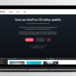
Credit: elements.envato.com
Introduction To Responsive Email Templates
Responsive email templates are essential for modern email marketing. They adapt to various screen sizes and devices. This ensures your email looks good on a smartphone, tablet, or desktop. Using a responsive template increases the chances of your email being read. Let’s explore why responsive design matters and why Mailchimp is a great choice.
Importance Of Responsive Design
People use different devices to check their emails. A responsive design ensures your email looks great on all devices. This increases engagement and improves user experience. Non-responsive emails can look distorted on small screens. This can lead to lower open rates and higher unsubscribe rates.
Responsive design is not just about fitting content on a screen. It also involves adjusting images, fonts, and buttons. This makes your email easy to read and interact with. A well-designed responsive email can boost your marketing efforts.
Why Use Mailchimp
Mailchimp is a popular email marketing platform. It offers many responsive email templates. These templates are easy to use and customize. Mailchimp’s drag-and-drop editor makes designing emails simple. You don’t need coding skills to create beautiful emails.
Mailchimp also provides analytics to track your email performance. This helps you understand what works and what doesn’t. With Mailchimp, you can create effective and responsive email campaigns. This can lead to better engagement and higher conversions.

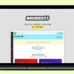
Credit: webdesign.tutsplus.com
Top Features To Look For
Choosing the best responsive email templates for Mailchimp can be challenging. There are key features to consider to ensure your emails perform well. This section will highlight the top features to look for in a responsive email template.
Mobile-friendly Layouts
Mobile-friendly layouts ensure your emails look great on any device. Many people check emails on their phones. A mobile-friendly layout adjusts the content to fit smaller screens. This increases readability and engagement. It also helps you reach a wider audience.
Customizable Designs
Customizable designs let you tailor the template to your brand. You can change colors, fonts, and images. This ensures your emails match your brand’s identity. Customization also helps create unique and engaging content. It makes your emails stand out in crowded inboxes.
How To Choose The Right Template
Choosing the right responsive email template for Mailchimp is essential. It ensures your emails look great on all devices. With so many options, it can be overwhelming. Here are some tips to help you make the best choice.
Assessing Your Needs
First, understand your specific needs. Do you need a template for newsletters, promotions, or updates? Each type serves a different purpose. Identify your goals and the type of content you will send.
- Newsletters: Informative and regular updates.
- Promotions: Highlight sales or special offers.
- Updates: Announce new products or services.
Consider your audience. Who will receive your emails? Tailor the template to their preferences. Think about the design. Do you want a simple layout or something more elaborate? The right template aligns with your brand’s look and feel.
Testing Responsiveness
Responsiveness is key. Test the template on different devices. Check how it looks on smartphones, tablets, and desktops. A good template adjusts seamlessly to all screen sizes.
Use Mailchimp’s preview tool. It shows how the email appears on various devices. Make sure buttons and links are easy to click. Text should be readable without zooming.
| Device | Key Features to Test |
|---|---|
| Smartphone | Readability, Clickable buttons |
| Tablet | Layout, Image clarity |
| Desktop | Overall design, Functionality |
Finally, send test emails to yourself and colleagues. Get feedback on the design and functionality. Make adjustments as needed. Your goal is to ensure a smooth experience for all recipients.
Popular Mailchimp Templates
Mailchimp is a popular tool for email marketing. One of its strengths is the variety of responsive email templates available. These templates help you create beautiful, functional emails that look great on any device. Let’s explore some of the popular Mailchimp templates and see what they offer.
Free Vs Paid Options
Mailchimp offers both free and paid templates. Free templates are a good start for beginners. They provide basic designs and functionalities. Paid templates offer more advanced features and customization options. They often include professional designs and support. Choosing between free and paid depends on your needs and budget.
Template Categories
Mailchimp templates come in various categories to suit different email types. There are templates for newsletters, promotional emails, and transactional emails. Newsletter templates are great for sharing updates and stories. Promotional templates help boost sales and special offers. Transactional templates are used for order confirmations and receipts. Each category has designs tailored to its purpose. This makes it easier to create emails that match your goals.
Customizing Your Template
Customizing your email template in Mailchimp ensures it aligns with your brand. It can boost engagement and make your emails stand out. Let’s explore how to add brand elements and adjust layouts effectively.
Adding Brand Elements
First, add your logo to the email header. This makes your brand instantly recognizable. Use high-quality images to keep it professional. Next, choose colors that match your brand’s palette. Consistent colors reinforce your brand identity.
Typography is another key element. Use fonts that reflect your brand’s personality. Stick to one or two fonts to maintain readability. Lastly, include social media icons with your brand’s unique style. This connects your email to your online presence.
Adjusting Layouts
Start by selecting a layout that fits your content. Mailchimp offers various pre-designed layouts. Choose one that suits your message type. Whether it’s a newsletter or a promotional email, the right layout matters.
Next, customize the sections. You can add or remove blocks as needed. This flexibility helps you tailor the email to your content. Adjust the size of images and text boxes for better visual balance. Ensure your email looks good on all devices by previewing it in different screen sizes.
Finally, keep your layout clean and simple. Too many elements can overwhelm the reader. A clean design improves readability and keeps the focus on your message.
Best Practices For Responsive Design
Creating responsive email templates for Mailchimp involves following best practices. These practices ensure your emails look great on any device. This improves engagement and user experience. Let’s explore some key tips for responsive design.
Optimizing Images
Images should load quickly and look good on all screens. Use compressed image files to reduce load times. Set image widths to 100% to ensure they resize properly. This helps them fit within the email layout on any device.
Also, add alt text to images. This ensures users understand the content even if images do not load. Alt text improves accessibility and enhances user experience.
Using Clear Call-to-actions
Call-to-actions (CTAs) should be clear and easy to tap on mobile devices. Use large buttons with ample padding around them. This makes it easier for users to click them.
Keep the CTA text concise and action-oriented. Phrases like “Shop Now” or “Learn More” work well. Ensure the CTA stands out by using a contrasting color. This draws attention and encourages clicks.
Case Studies And Examples
Understanding real-world applications can help you create effective email campaigns. This section explores successful campaigns using responsive email templates for Mailchimp. You’ll discover what worked and why.
Successful Campaigns
Here are some examples of successful email campaigns using responsive templates:
| Company | Campaign | Results |
|---|---|---|
| XYZ Apparel | Summer Sale | Increased open rates by 25% |
| ABC Electronics | New Product Launch | Boosted click-through rates by 35% |
| 123 Travel | Holiday Offers | Enhanced customer engagement by 40% |
Lessons Learned
From these campaigns, we learned important lessons:
- Focus on Design: A clean, attractive design grabs attention.
- Mobile Optimization: Ensure emails look good on all devices.
- Clear Call-to-Action: Make it easy for readers to take the next step.
- Personalization: Tailored content increases engagement.
These elements can significantly improve your email marketing results.
Conclusion And Next Steps
The journey of creating the best responsive email templates for Mailchimp doesn’t end with selection. The next steps involve implementing your chosen template and optimizing it for the best performance. These steps are crucial to ensure your emails look good and are effective in engaging your audience. Here’s how to proceed.
Implementing Your Template
After selecting the best responsive email template, the first step is to implement it in Mailchimp. Follow these steps:
- Log in to your Mailchimp account.
- Navigate to the ‘Templates’ section.
- Click on ‘Create Template’.
- Choose ‘Code Your Own’ to upload your template.
- Paste the HTML code of your template.
- Save and name your template for easy access.
Ensure all links, images, and buttons are functional. Test the template to check its responsiveness on various devices.
Ongoing Optimization
Once your template is live, focus on ongoing optimization. Here are some tips:
- Monitor Performance: Track open rates, click-through rates, and conversions.
- Gather Feedback: Ask subscribers for feedback to find areas for improvement.
- A/B Testing: Test different subject lines, content, and images to see what works best.
- Update Content: Keep your email content fresh and relevant to maintain engagement.
Regularly review your email campaigns to ensure they meet your goals. Make adjustments based on data and feedback for continuous improvement.
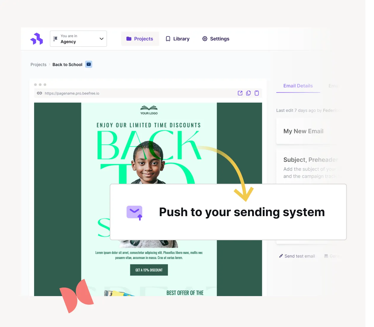
Credit: beefree.io
Frequently Asked Questions
What Are Responsive Email Templates?
Responsive email templates adapt to different screen sizes. They ensure your email looks great on any device, whether it’s a smartphone, tablet, or desktop. This improves user experience and engagement.
Why Use Mailchimp For Email Templates?
Mailchimp offers a user-friendly platform. It provides a variety of customizable, responsive email templates. This makes creating professional emails easier and more efficient.
How Do Responsive Templates Boost Engagement?
Responsive templates ensure your emails are readable on all devices. This increases the likelihood of interaction and engagement. Better readability leads to higher click-through rates.
Can I Customize Mailchimp Templates?
Yes, Mailchimp templates are highly customizable. You can adjust colors, fonts, and layouts. This allows you to match your brand’s identity easily.
Conclusion
Choosing the best responsive email templates for Mailchimp can boost engagement. These templates ensure your emails look great on any device. They save you time and effort. Your subscribers will appreciate the polished, professional look. Start experimenting with different templates.
Find what works best for your audience. Happy emailing!

February 28, 2025
Getresponse Vs Sendinblue Comparing Features

February 28, 2025